HEALING

IS NOT

NEUTRAL

Every therapist site looks like it was designed by the same three people in matching beige cardigans. Yours shouldn't. I build Squarespace sites that look like you — and speak to the clients you want on your schedule.

No ferns. No stacked rocks. No sage gradient. No stock photo of a woman staring wistfully out of a window.

yours, loudly

〰️

show people who YOU are

〰️

let the right clients find you

〰️

yours, loudly 〰️ show people who YOU are 〰️ let the right clients find you 〰️

Three things every site I build does

Says who it’s for

Your niche, in your words, above the fold — not buried on page four under "specialties."
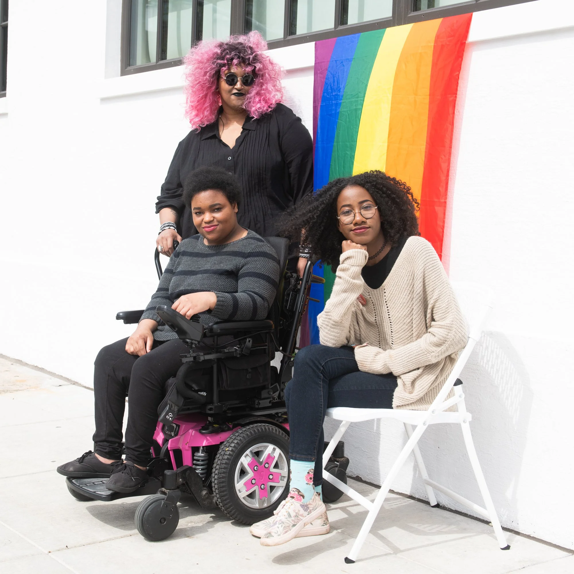
Group of three women, one in a wheelchair, outdoors in front of a white wall with a rainbow pride flag. The women are diverse in appearance, with one woman having pink curly hair and wearing dark sunglasses, another with short dark hair and wearing a striped sweater, and the third with long curly hair, glasses, and a beige sweater. They are posing and appear to be at a pride event.

Shows who it’s for

Before a client reads a word, they're looking for themselves. Every project gets imagery of the people you actually treat.
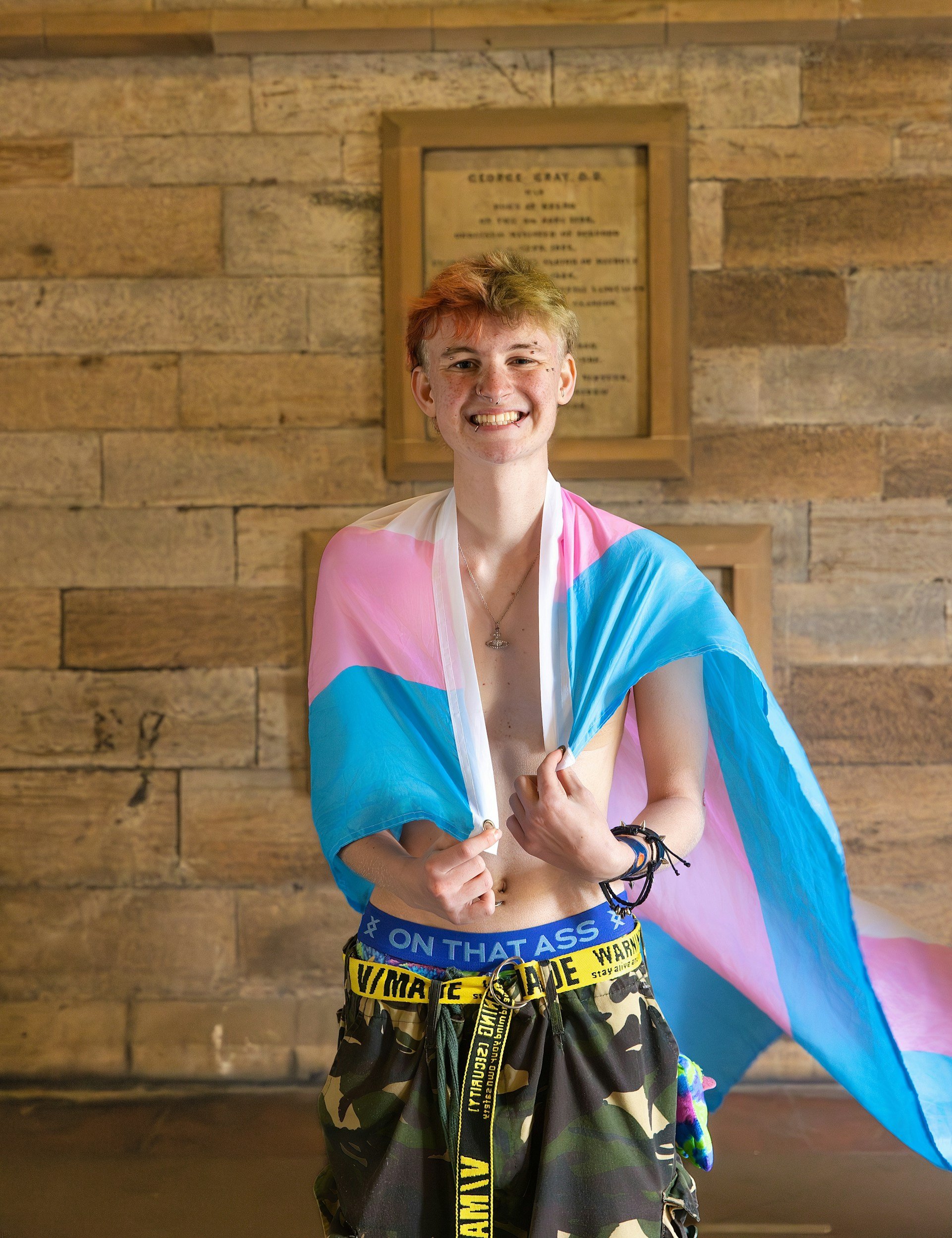
A smiling young person with short, light-colored hair and piercings, wearing a colorful flag draped over their shoulders and camouflage-patterned shorts with yellow and black caution-style text belts, standing in front of a wooden wall with framed documents.

Lets them reach you

Accessible navigation, image alt text, good contrast, no barriers. Accessible because your clients deserve it.


Two women having a conversation at a small round table in a bright room with large windows.
Two friends, a person with curly blonde hair, glasses, and a septum piercing, and another with short curly red hair and a septum piercing, are taking a selfie together while wearing white T-shirts. The image is taken from a low angle, capturing their smiling faces against a plain white background.

Why this matters

A neutral site attracts nobody in particular

Your potential client isn't googling "therapist." They’re googling whether you'll get it — the transition, the chronic pain, the code switching, the family that doesn't speak to them anymore. Your site has about four seconds to answer.

You're in the right place if you've thought any of this.

My site looks fine but it doesn't sound anything like me.

I know exactly who I want to work with. My website doesn't say so.

I keep getting inquiries from people I'm not the right therapist for.

I've been "about to redo the website" for two years now.

Every photo on my site is a white couple on a couch and I hate it.

All five? We should talk.

Book a call

Latest Work

No two look alike.

  • "I didn't give Cort much to go on, just a name and my specialities, and he created such a beautiful site for me. But my favorite part is the page he made for my therapy cat."

    Anne P.

  • "Working with Cort to build the website for my dream private practice was a wonderful experience. He was attentive, creative, and genuinely supportive of my ideas throughout the entire process. Cort took the time to understand my vision and created a website that not only reflected what I had imagined, but exceeded my expectations. Cort is incredibly knowledgeable about his craft, and I especially appreciated that he took the time to teach me how to maintain and update my website once it was completed. I felt supported from beginning to end and couldn't be happier with the final product. I highly recommend Cort to anyone looking for a talented, patient, and creative website designer!"

    Erica M.

Let’s make it loud.